New website takes 60-year, county-by-county look at who moves where
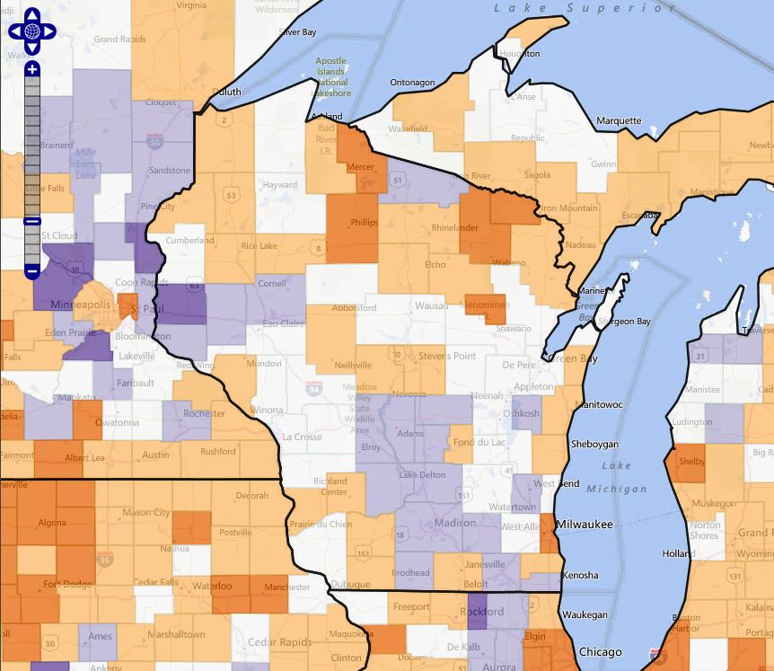
The website allows users to see patterns of migration in each county in the U.S. In this map of Wisconsin, for example, the purple counties experienced the most net in-migration during the 2000s while the orange counties experienced out-migration. Counties in white gained slightly.
Image: Applied Population Laboratory
You can tell a lot about what a community has to offer by the types of people that are moving in and the types that choose to leave.
Whether an area attracts or loses residents of a certain age group, or race, or gender, says something about the opportunities and amenities you’ll find there, says Katherine Curtis, associate professor of community and environmental sociology at UW–Madison.
Curtis, a researcher at the university’s Applied Population Laboratory (APL), is part of a multi-state team that has developed new estimates of net migration — the difference between residents moving in and out — for every U.S. county from 2000 to 2010. The estimates are broken down by age, sex, race and Hispanic origin. Combined with similar estimates from previous decades, the new numbers offer a chance to make decade-by-decade comparisons of migration by age group from 1950 to present.

Katherine Curtis
Those 60 years worth of estimates are now available online at APL’s Net Migration website, where users can graph, map and compare migration trends for counties across the nation. The site was created by APL web developer Jim Beaudoin.
“Examining net migration trends helps tell stories of regional and community character and social change,” says APL director Dan Veroff.
For example, Kenosha County’s migration signature shows the shift from manufacturing (an influx of people in their 20s) to rustbelt decline (a net loss in the same age group) to suburban (a big gain of people in their 30s) as the area went through auto manufacturing’s boom and bust, then became home to people commuting to Chicago-area jobs.

Dan Veroff
At the opposite end of the state, net migration in Burnett and Vilas counties is sharply negative for people in their 20s — an exodus typical in remote rural areas — and highest for those in their 60s, as retirees settle to enjoy the lakes and forests. As a result, these counties have some of the state’s fastest-aging populations.
“When we see how these things line up over time, we can get a glimpse of the future as well,” he says. “This is useful for people who need to plan for providing services. It can show if a certain population is going to be stable, or decline or increase. School districts, for example, can use it to project enrollment trends.”
While net migration data have been available in the past, it used to require the skills and tools of a demographer to tease it out of large and complicated datasets. The new website eliminates that barrier, says Veroff.
“One of our goals is to democratize data,” he says. “This effort fits squarely in that realm — making useful data available and easy to use for people in many different positions.”
Veroff describes the website and its uses in the APL newsletter.
In addition to Curtis and Beaudoin, the research team includes team leaders Richelle Winkler of Michigan Tech University and Kenneth Johnson of the University of New Hampshire, as well as Cheng Cheng of Princeton University and Paul Voss of the University of North Carolina.
Subscribe to Wisconsin Ideas
Want more stories of the Wisconsin Idea in action? Sign-up for our monthly e-newsletter highlighting how Badgers are taking their education and research beyond the boundaries of the classroom to improve lives.


