‘Flatten the curve’ was everywhere, but it didn’t change people’s pandemic attitudes
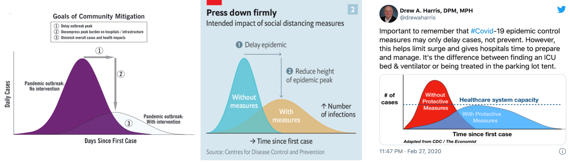
The CDC produced the original image, which showed how disease-control behaviors could reduce the peak of infections in a pandemic. Amplified by The Economist and on Twitter during the spring of 2020, the message took off. CDC / The Economist / Drew Harris / Nan Li
Early in the COVID-19 pandemic, one message became ubiquitous: “flatten the curve.”
Tied to a compelling, simple chart of infections over time with and without interventions, the message encouraged people to socially distance to delay and reduce the peak of infections, preventing hospitals from becoming overwhelmed.
A new study from University of Wisconsin–Madison researchers has found that the message spread far, reaching nearly three-quarters of Americans by August 2020. But an individual’s awareness of the flatten-the-curve graphic did not predict their willingness to engage in social distancing or their belief in society’s ability to control the course of the pandemic.
However, people who had seen the widespread chart relied less on their trust in scientists when determining how controllable the pandemic was. This suggests that the flatten-the-curve message might have armed them with the knowledge they needed to draw their own conclusions about social distancing measures without needing to rely as strongly on trusting experts.

Nan Li

Amanda Molder
“This chart became the visual mantra that defined the initial pandemic response in the U.S.,” says Nan Li, a professor of life sciences communication at UW–Madison who led the research. “Although we didn’t see a difference in people’s ideas or behavioral intentions based on their awareness of the chart, the message is still beneficial because there’s some evidence that it allowed people to form a more informed decision without relying on trust.”
Li and UW–Madison doctoral student Amanda Molder published their findings Aug. 27 in the journal Public Understanding of Science.
A version of the chart and the phrase “flatten the curve” first appeared in a 2007 report by the Centers for Disease Control and Prevention about ways to control the spread of a pandemic. With interventions like social distancing and mask wearing, the CDC said, the peak of infections could be delayed and lowered, and the total number of infections could be reduced.
In February of 2020, The Economist printed a modified version of the chart showing the delay in peak infections and the lowering of the peak. However, the magazine removed the CDC’s message that preventative measures could also reduce the total number of infections, instead focusing on not overwhelming hospital capacity.
Population health educator Drew Harris adapted The Economist’s chart to share on Twitter. He added a dotted line representing the capacity of the health care system, further emphasizing this capacity-based goal.
The message took off. The Instagram hashtag #FlattenTheCurve was shared more than a million times and Google searches for the phrase soared.
“I think scientists should definitely do more of this kind of visual messaging,” says Li. “Who knows, maybe it will save a lot of lives.”
While watching the spread of the chart, Li and Molder predicted that its simplicity would help people understand the benefits of interventions like social distancing. So in July and August of 2020, they surveyed a representative sample of 500 American adults and asked them if they had ever seen the chart. The survey also asked respondents to rate the effectiveness of social distancing measures, how controllable they thought the pandemic was, and their trust in the CDC and other scientists.
More than 70% of respondents said they were very likely to engage in social distancing, while about 40% thought that the pandemic could be brought under control with these interventions. When asked who they trusted, people ranked medical professionals ahead of other scientists and the CDC.
While 74% of adults said they were aware of the chart, this awareness did not correlate with their intention to engage in social distancing or their belief in whether interventions could control the pandemic.
Li says that the timing of the survey during a summer surge in cases and the ubiquity of both the flatten the curve message and social distancing measures make it difficult to determine the true effect of the infographic.
“I would suggest that people not underestimate how effective the chart was based on this finding alone, because the popularity of this chart itself is strong evidence of how important the message was and how critical it is for scientists to send the right message out about something like this,” she says.
That the flatten the curve graphic reached so many people shows the power of simple, strong, visual messages, says Li. Although the most popular versions removed messages about reducing the overall case numbers of COVID-19, their focus on protecting hospital capacity seemed to connect strongly with people who could envision their local hospitals filling up.
“I think scientists should definitely do more of this kind of visual messaging,” says Li. “Who knows, maybe it will save a lot of lives.”
Tags: communications, covid-19, health
-
Interwoven
How Indigenous knowledge and science can work together to communicate about climate.
-
UW–Madison’s reach throughout Wisconsin adds up to $38.9 billion a year
The university supports more than 287,000 jobs and helps drive private-sector growth.
-
‘Being part of something bigger than you’ with Badger Volunteers
UW–Madison students head into the local community to find purpose and make a difference.
-
UW–Madison’s Tech Exploration Lab: Where the classroom meets the real world
The lab is built around a simple expectation: Students come to build, test and refine projects with real problems in mind.